Posts

Showing posts from October, 2020

Layers of Life

Image
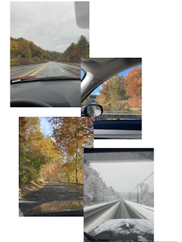
             “Layers allow the designer to treat the image as a collection of assets... designers use layered files to generate storyboard” (Lupton 141).       With that quote in mind, I wanted to utilize layering to showcase two storyboards. I feel like layering can oftentimes be very complex and end up looking messy to some. I wanted to make a more minimalistic, structured form of collaging/ layering while still being able to provide a flow and narrative. I made the first storyboard of the new England fall. All images were taken this week from Tuesday- Friday. Wasn't expecting there to be snow on Friday but I feel like those that accurately represents how bipolar the weather in New England can be. For the second collage, I wanted to showcase what my days, despite being filled with homework, typically look like in quarantine. For me, it is such a vast difference from what my life was like before corona. Pre-pandemic I never us...

Frame of Frames.

Image
  This week I wanted to use natural, passive framing. I wanted to use typical items as framing for the images to showcase how everyday items work in conjunction with each other to showcase beauty. The images below are all images that I feel showcase that statement. There are sharp lines and clear cut-off parts of each image that help act as the border.  “a border is the frontier between inside and outside, marking the edge of a territory” (Lupton & Phillips 125). ). The center is the focal point but the framing helps give it context and familiarity. the natural borders in these images help empathize what is meant to be seen.   “A-frame can serve to either emphasize or downplay its contents” (Lupton 25). The frame here is the literal window frame itself showcasing the beautiful sunrise. The outlining of the closet in this image acts as a structural framing for the image. The center and focal point being the two people inside.  This image is a reversal of the ...
Image
 This week I had a difficult time coming up with something that could adequately fit the theme. I initially tried drawing abstract images that really captured the essence of ambiguity so much so that I myself didn't even know how to interpret it. I didn't really resonate with the images and found myself feeling uninspired by them.      I decided to try and pursue the themes and goals of this week in what I love; food. These three images both resonated with me and were able to touch upon some of the themes and techniques mentioned in the reading. "All things exist in interactions with other things." ( Lupton/Phillips 98)                                         This image utilizes the concept of negative and positive space, with the white background being the negative space and the toast and fruit being the figure and foreground. It also utilizes the ...

Colors in Album Covers

Image
"Color can convey a mood, describe reality, or codify information. Words like "gloomy", "drab" and "glittering" each bring to mind a general climate of colors, a palette of relationships." (Lupton/Phillips 81)      Just as these words can be used to describe art, they similarly can be used to describe music as well. With this framework in mind, I wanted to showcase some of my favorite album covers. These album covers, to me, perfectly convey how the musician is feeling and the viewer is able to get an accurate sense of what the musical content will be just by looking at the cover. The artist's usage of color, images, arrangement, and placement in the album artwork all helps in providing a wholistic image of themselves and their message. All the album covers I'm using heavily utilize color combinations to create sharp focus. Moreover, they utilize the interaction of color idea that is talked about on pages 87 and 88.              ...