Posts

The End.

                Coming into this class I was nervous. Art has always been something I tried to stay far away from but this class really helped me realize that art is subject and can come in so many different forms. Every theme and element from this book brought a whole new  dimension to my understanding of the creative process behind works of art. My favorite themes were point, line and plane and the gestalt principles. Moving forward, I want to utilize the lessons learned from this class and implement them into my photography. I am keen on taking more photography/art based classes to help me refine my craft. I am grateful that I was amble to share my work with you guys and truly feel like I have learned so much. 

Motion.

Image
  “Motion is a kind of change, and change takes place in time. Motion can be implied as well as literal...” (Lupton 233). For this weeks theme I wanted to take images that literally felt like they were alive and moving.  To me, motion in photographs can best be seen when taking a photo lights. In this image I went to a shopping plaza near my house and gently shook my phone while taking the image. It gives the photo an accidental effect while still having it be interesting and capture your attention. This image was taken in a moving car which definitely gives a moving effect. It feels as though you too are moving while looking at the buildings in downtown Boston. Again, I was drawn to utilizing lights in capturing motion. I like how they have a fuzzy/blurry look to them when not captured still.  This is an older image from august but im throwing it in here because again I feel like this truly capture motion. You can make out what it is but the natural motion induced blur creates interes
Image
  “diagrams can depict the anatomy of a creature, the hierarchy of a corporation, or the flow of ideas” (215)           As someone that studies marine biology, diagrams are often utilized to showcase the relationships between organisms and their structure and function. For this weeks theme I wanted to showcase the relationship between fish and coral and how they live  harmoniously under the sea. I wanted to make more of an artistic diagram rather than a factual/educational one so I obtained inspiration from a post stamp. The post stamp I used I thought was fun and showcases my favorite coral; elk horn coral.  ( Image source ) I chose to recreate the image on the furthest left, with the black fish and orange coral.  I used an app called procreate to recreate this image. Here is my rendition:  Had a really fun time making this diagram. Follow my  Instagram  for more. 

Grids in society

Image
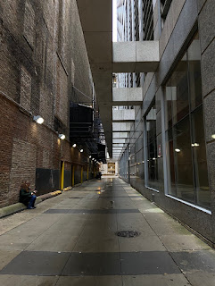
                                           “Grids function throughout society.” (Lupton 187)                                   Grids are utilized everywhere in daily life. They provide structure and function. This week, I took a trip into the city to see if I could find grids without actively seeking them out/ being too obvious.                                                            This alley way utilizes grids everywhere. From the windows on the right, to the street to the wall on the left. There are clear and distinct squares practically everywhere you look. Moreover, it utilizes the theme of pattern as well because they are all ongoing repetitive and succinct.  In this image, it may be a little more difficult to see the grid.  "the grid can work quietly in the background, or it can assert itself as an active element" (Lupton & Phillips 175). this quote, I feel, can directly  apply to this image.  The sushi itself, is a grid, each piece representing a square. The p

Layers of Life

Image
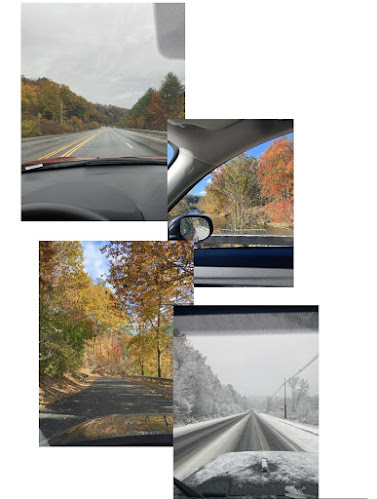
             “Layers allow the designer to treat the image as a collection of assets... designers use layered files to generate storyboard” (Lupton 141).       With that quote in mind, I wanted to utilize layering to showcase two storyboards. I feel like layering can oftentimes be very complex and end up looking messy to some. I wanted to make a more minimalistic, structured form of collaging/ layering while still being able to provide a flow and narrative. I made the first storyboard of the new England fall. All images were taken this week from Tuesday- Friday. Wasn't expecting there to be snow on Friday but I feel like those that accurately represents how bipolar the weather in New England can be. For the second collage, I wanted to showcase what my days, despite being filled with homework, typically look like in quarantine. For me, it is such a vast difference from what my life was like before corona. Pre-pandemic I never used to spend time in my room, I was always out and busy.

Frame of Frames.

Image
  This week I wanted to use natural, passive framing. I wanted to use typical items as framing for the images to showcase how everyday items work in conjunction with each other to showcase beauty. The images below are all images that I feel showcase that statement. There are sharp lines and clear cut-off parts of each image that help act as the border.  “a border is the frontier between inside and outside, marking the edge of a territory” (Lupton & Phillips 125). ). The center is the focal point but the framing helps give it context and familiarity. the natural borders in these images help empathize what is meant to be seen.   “A-frame can serve to either emphasize or downplay its contents” (Lupton 25). The frame here is the literal window frame itself showcasing the beautiful sunrise. The outlining of the closet in this image acts as a structural framing for the image. The center and focal point being the two people inside.  This image is a reversal of the theme, a culmination of
Image
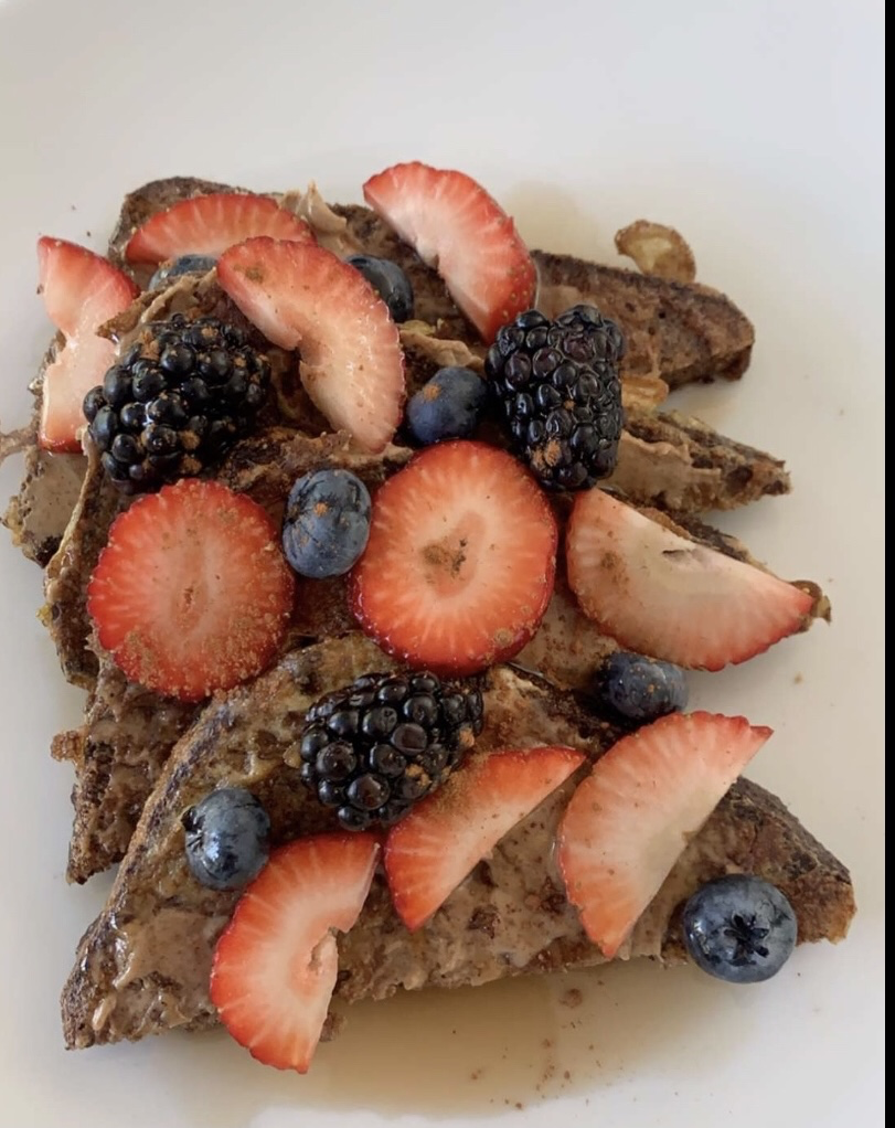
 This week I had a difficult time coming up with something that could adequately fit the theme. I initially tried drawing abstract images that really captured the essence of ambiguity so much so that I myself didn't even know how to interpret it. I didn't really resonate with the images and found myself feeling uninspired by them.      I decided to try and pursue the themes and goals of this week in what I love; food. These three images both resonated with me and were able to touch upon some of the themes and techniques mentioned in the reading. "All things exist in interactions with other things." ( Lupton/Phillips 98)                                         This image utilizes the concept of negative and positive space, with the white background being the negative space and the toast and fruit being the figure and foreground. It also utilizes the six models of grouping, the fruit implies similarity and simplicity, proximity is represented by the arrangement of the f